The (Entire) Distribution of Wealth
We have heard a lot about rising wealth inequality in recent years. The rich are getting richer at the expense of everybody else, the story often goes. Yet because researchers tend to focus rather narrowly on the top of the wealth distribution, we actually don’t know much about what is going on in the other parts of the distribution. Of course, it makes sense to focus on the top, since this is where much of the action has taken place, and where data availability is at its best, but it comes with a cost: it only informs us about the fortunes of a small fraction of the population. How have the fortunes of the vast majority of citizens evolved? Is the slice of the pie of total wealth getting smaller for all classes except the wealthiest? Or are some classes doing better than others?
To present a sense of these questions, I will look at the shares of total net wealth received by different parts of the wealth distribution using data from the World Inequality Database (wid.world), which is a database on (mainly) income and wealth inequality collected by a host of prominent economists. I focus on the United States and France because data availability is best for these two countries and because they provide a good contrast between the evolution in the US and Europe.
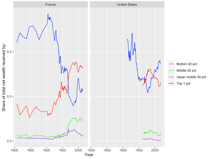
In the figure below I have plotted the share of total net wealth received by the top 1 percent (p99p100), the upper middle 30 percent (p60p90), the middle 20 percent (p40p60), and the bottom 40 percent (p0p40) for the two countries separately. Data availability is best for France, where all series stretch all the way back to 1807 and end in 2014. In the US, data on the wealth share of the top of the distribution is available from 1913 to 2019; for the rest of the distribution, the series begins in 1962.

If we start by looking at the wealth share of the top 1 percent (the blue lines), we see some familiar trends. The share of total wealth received by the one percent wealthiest hovered around 50 percent for most of the 19th century in France, whereafter it declined rapidly to around 30 percent in the mid-20th century, followed by a further drop to its all-time low of 16 percent in 1984. Since the mid-1980s the top one percent has increased its wealth share and in 2014, it owned around 23 percent of all wealth in France. In the US, we see a similar drop as in France in the early to mid-20th century, followed by a rapid and continuous rise until today, where the top one percent owns about 35 percent of total wealth in the US. Thus, since the mid-20th century the evolutions of the fortunes of the wealthiest individuals follow a fairly similar pattern in both France and the US.
But if we look at the rest of the distribution, we see much starker differences. In France, the upper middle part of wealth distribution (red line) has steadily accumulated more of total wealth since the early 20th century and has owned a fairly stable share of total income around 30-35 percent since the 1970s. The same is true of the middle twenty percent of the distribution (green line), which has owned a stable share of wealth around ten percent since the 1980s. The real ‘losers’ in France is the bottom forty percent of wealth owners (purple line) whose share of total wealth has decreased from a high of 5.3 percent in 1969 to 2.6 percent in 2014. Thus, in France, although the wealthy have been getting wealthier, the entire middle and upper parts of the distribution have been also doing fairly well in the last 50 years, and very well compared to 100 years ago.
In the US, the story is different and follows more closely the one set out at the beginning of this blog post. Except for those at the absolute top, individuals in all parts of the wealth distribution have experienced declining shares of total wealth since the early 1990s. The upper middle 30 percent owned about 32 percent of total wealth in 1978 (the all-time high since 1962), but now (2019) it owns just 26 percent. Likewise, the middle 20 percent has experienced a drop from its high of 4.8 percent in 1987 to its low of 2.4 percent in 2011, whereafter it has bounced back to 3.2 percent in 2019. And whereas the bottom 40 percent owned about 1 percent of total income in the 1980s, it owned about 0.4 percent in 2019. The US looks much more like a ‘winner-takes-all’ economy than France.
To wrap up, focusing rather narrowly on the top of the wealth distribution (or any distribution for that matter) can give us a greater sense of similarity across countries than actually exists. We may also paint a more pessimistic portrait than reality. In France, we see that a majority of wealth owners have owned a slightly increasing, but overall fairly stable, share of total wealth in the last fifty years. By contrast, in the US, the vast majority of wealth owners have experienced declining shares of wealth, especially since the 1990s. This points to the importance of broadening our perspective to include larger parts of distributions in future analyses.


